Coordinating Your Art with Your Furniture and Interiors | Guest Post
Interior isn’t as simple as it sounds when you’re moving into a new place or redecorating an old one. After you’ve picked out your favorite furniture, gotten the lighting just the way you like it, hung up all of your favorite pictures and paintings, and set the ever tasteful statue of Yogi Bear up in the corner of your living room next to your karaoke machine, you might find that what sounded brilliant in your head looks like nothing so much as a jumbled mess. Let’s go over some of the basics of what how to put together something that doesn’t rub your eyes the wrong way.
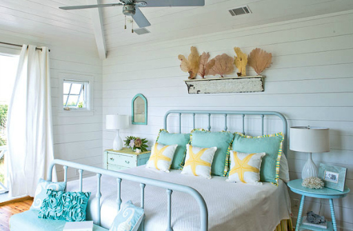
Pick a Theme
The way to ensure that everything has a unified look is to pick a few details that will unify the entire thing. No, we’re not talking about a theme like at a theme party (unless you really want to), instead it’ll be something much more general. Go with something broad, like “woodsy”, “modern”, “country”, or “retro”. These things are relatively vague, and because of that will still allow you a lot of options while also narrowing your focus significantly. The type of theme you choose is entirely arbitrary, but if you’re fiscally conscious you’ll just go with whatever style most of your stuff already reflects.

If you’re going with a smooth, minimalist modern look your furniture would have simple, solid colors, and flow in abstract curves as well as utilitarian looking angles. Your chairs might be a sinuously curved work of art around an equally abstract looking table all in black, but the paintings on your walls might well be all sharp angles and riotous colors. The contrast is pleasing while not being distracting because in both cases we’re still within the modern, and abstract sort of genre.
Colors
You’ve already got your major unifying concept, but you to get it to look like a single, intentionally put-together room you’ll need to place a few color restrictions on yourself. Choose a few complementary colors that will dominate the décor, and minimize the presence of anything that doesn’t fit. Besides that you’ll want to match the types of colors. Don’t put a faded looking watercolor painting up on a boldly colored wall, because it will wash out the painting and look unnatural. In the same way you won’t want to combine unfinished wooden art frames with lacquered highly processed looking wooden furniture.

Texture
The last thing you’ll need to think about is texture. The physical texture of your room should reflect what you see in the art on your walls. If your couch is built out of gnarled and knotted wood, your coffee table is made of stone, and a potted pine tree is your favored type of houseplant then the art on your wall needs to reflect that. That doesn’t mean it needs to be a forest landscape painting, but a lake, a rugged mountain, or something realistic and out of doors would definitely be called for. Combining that with your appreciation for cubism would not, for example, be appropriate in that case.

Edward Stuart is an art and decoration enthusiast as well as an online publisher for Canvas Art. He frequently blogs on the topics of art, art history, design, and home decor.